Client
Aapla Macchiwala™
आपला मच्छीवाला, “our fishmonger.” A fresh-fish brand built to feel like the neighbourhood you trust, dressed with the polish of a modern retail label. Caught fresh, brought fresh, from the harbour to the home.

Aapla Macchiwala set out to make everyday fish feel premium without losing the warmth of the local market. The brief was a brand that a family recognises instantly and a new customer takes seriously.
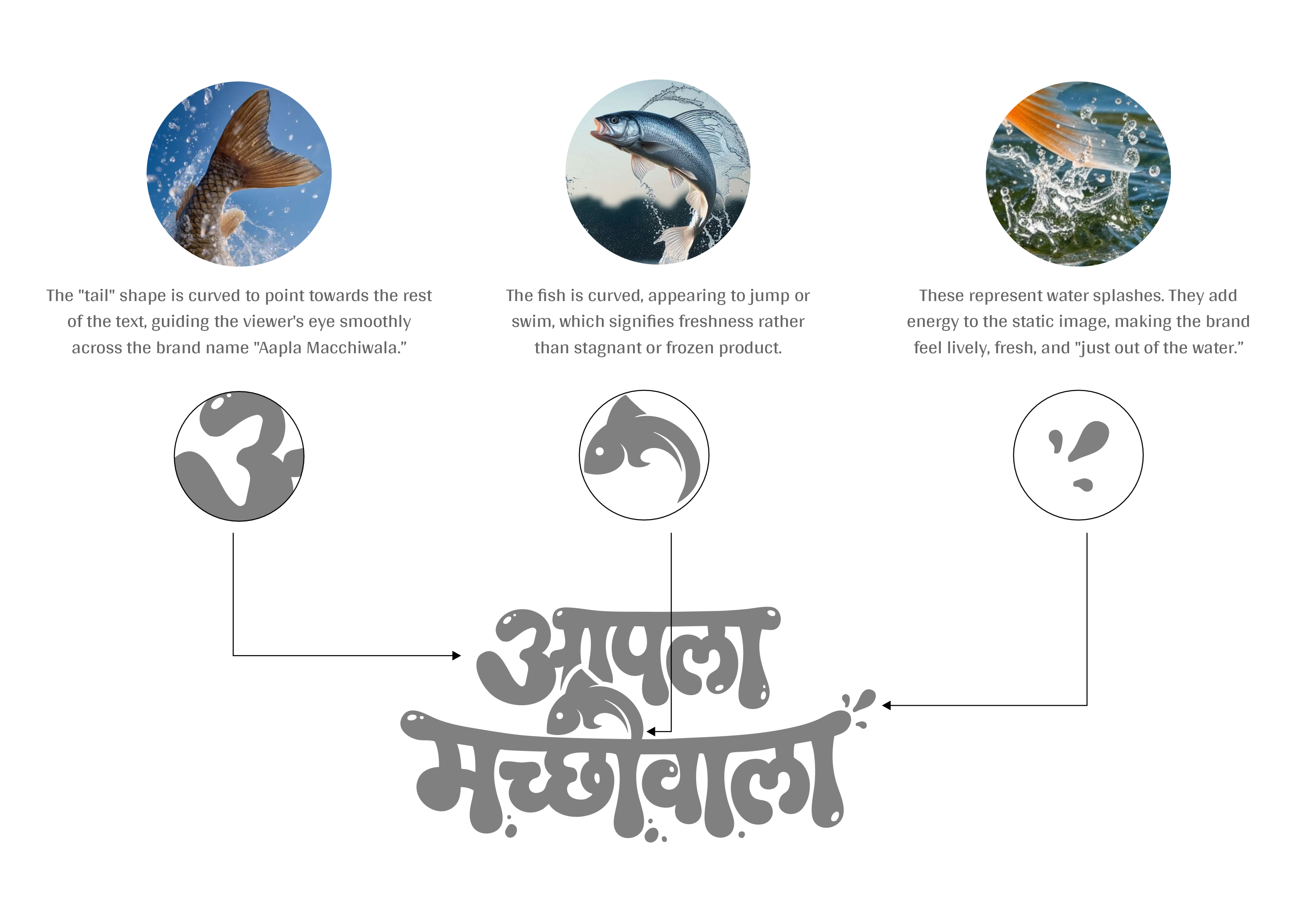
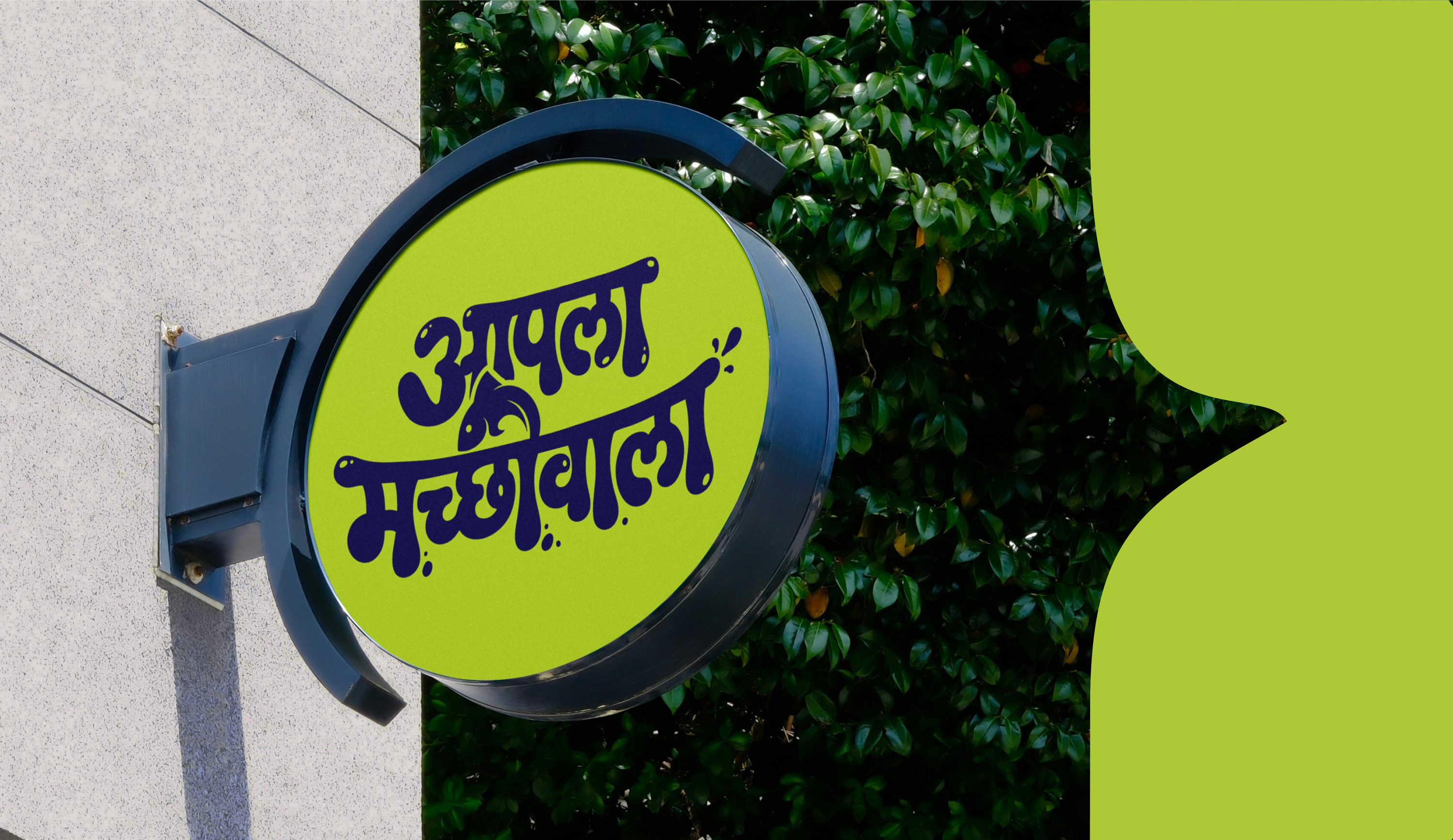
We built the identity around a single custom Marathi wordmark, drawn so the name itself carries the product.
The word “Aapla”, ours, does the heavy lifting. It positions the brand as familiar, reliable, community-led, while the system signals freshness and care at every touchpoint.
Premium, but never distant. Friendly, but never careless.
Bubbly, dripping letterforms evoke water and movement. A hidden fish-tail sits inside the script, and a deep navy, fresh cyan, and vital lime carry trust, freshness, and energy.
A fish-tail motif becomes a repeatable pattern across every surface.
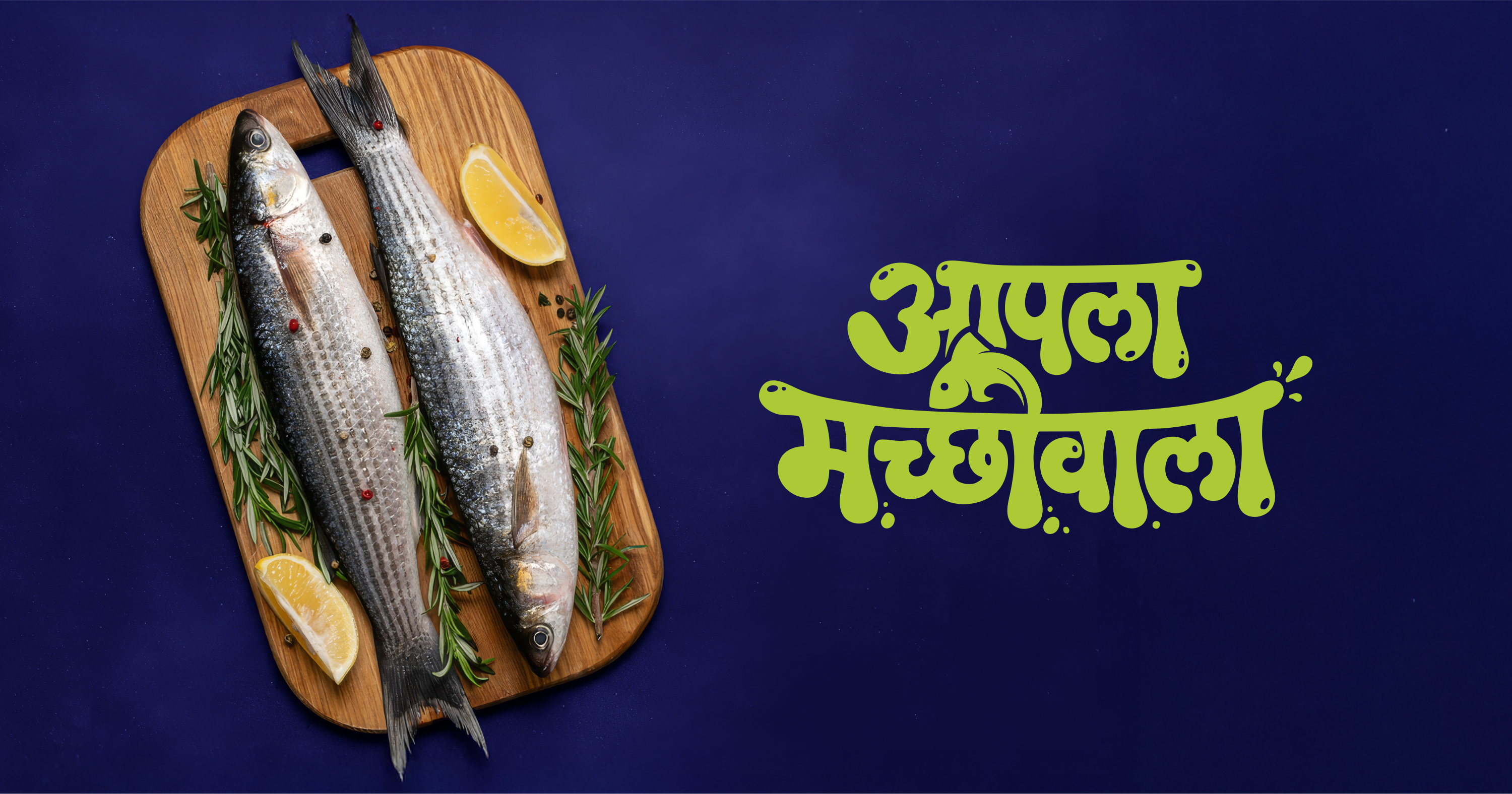
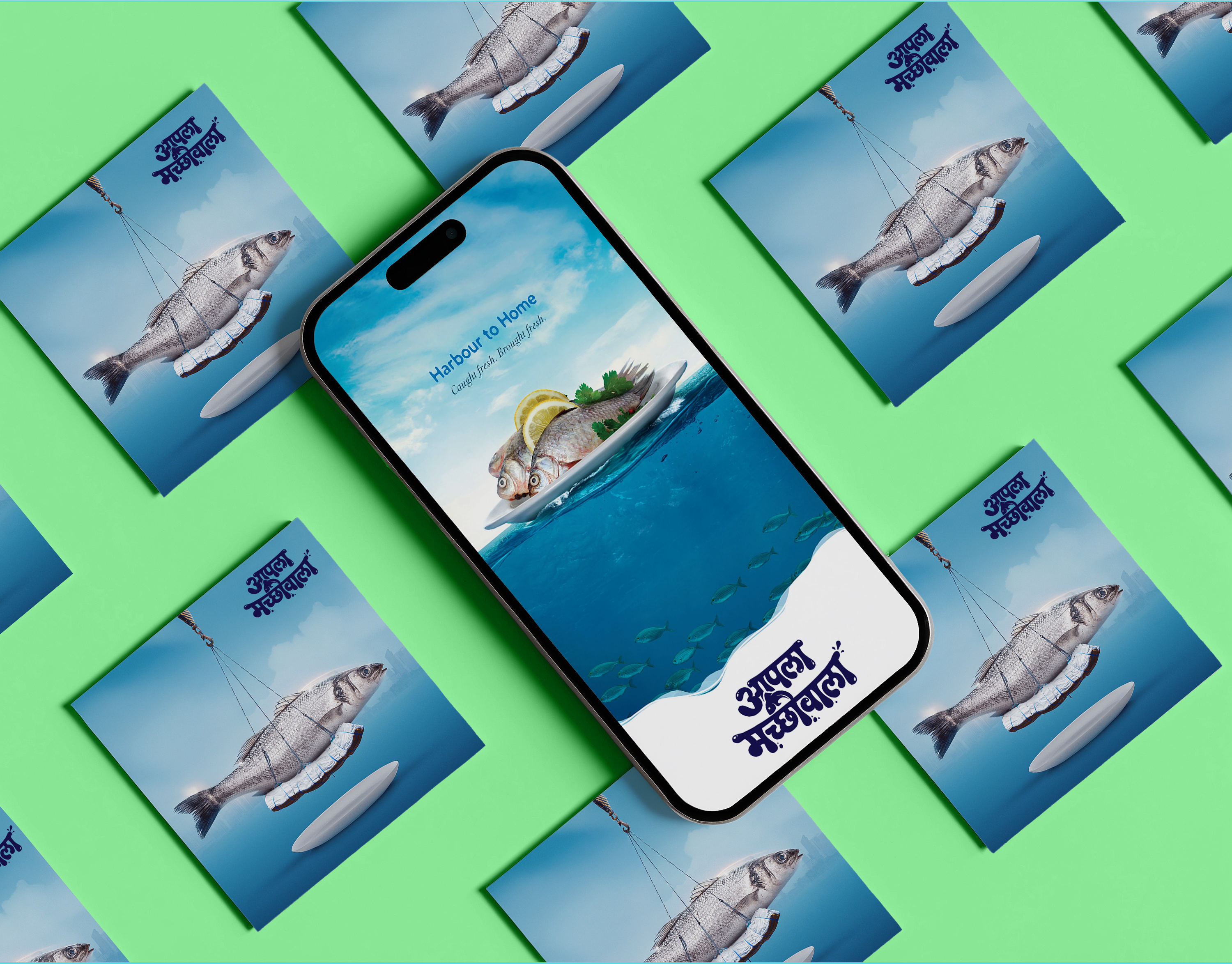
Photography keeps the fish honest, real texture, real light, while the navy ground and lime lettering give it the confidence of a premium grocery brand.
Every frame answers one question: does this look fresh enough to buy today?
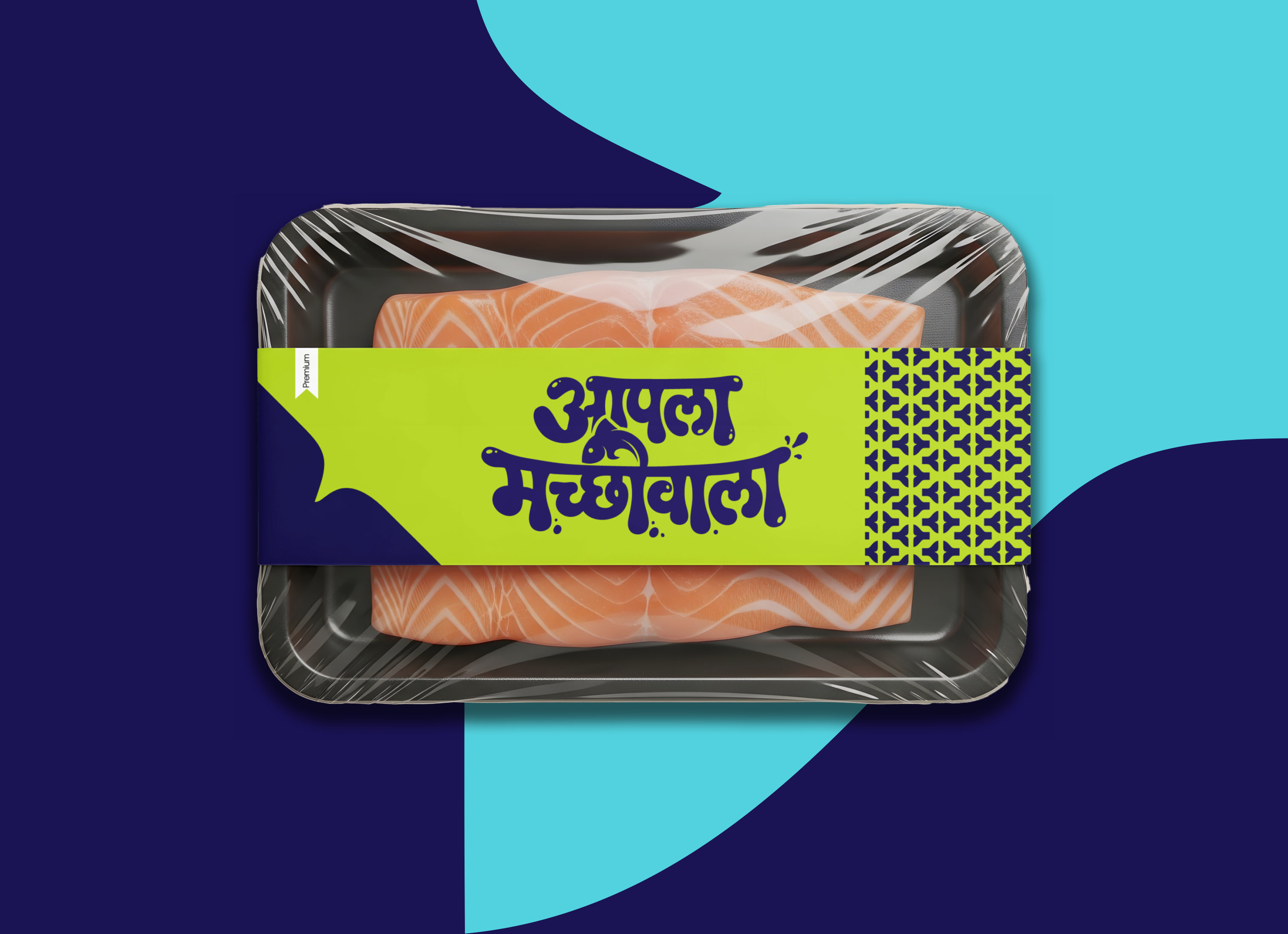
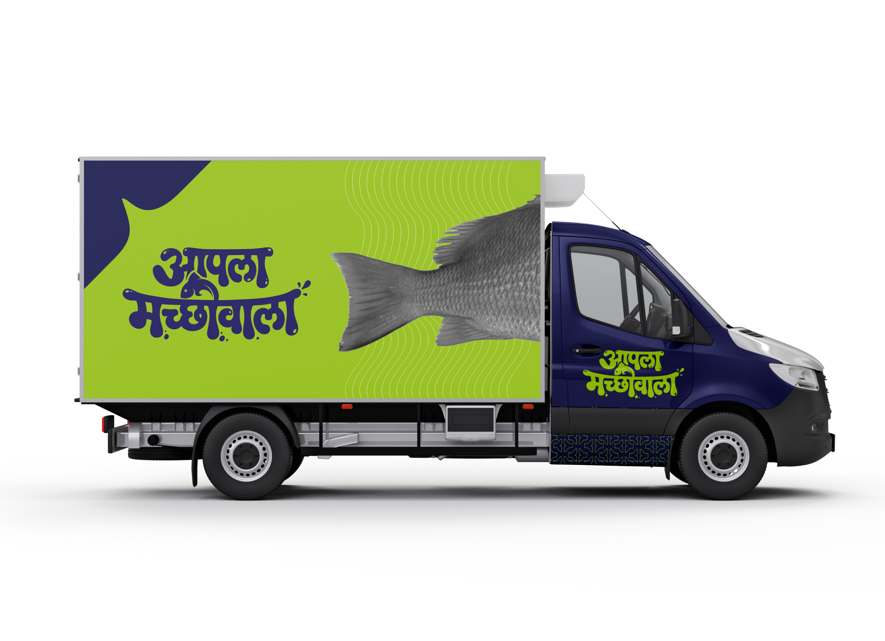
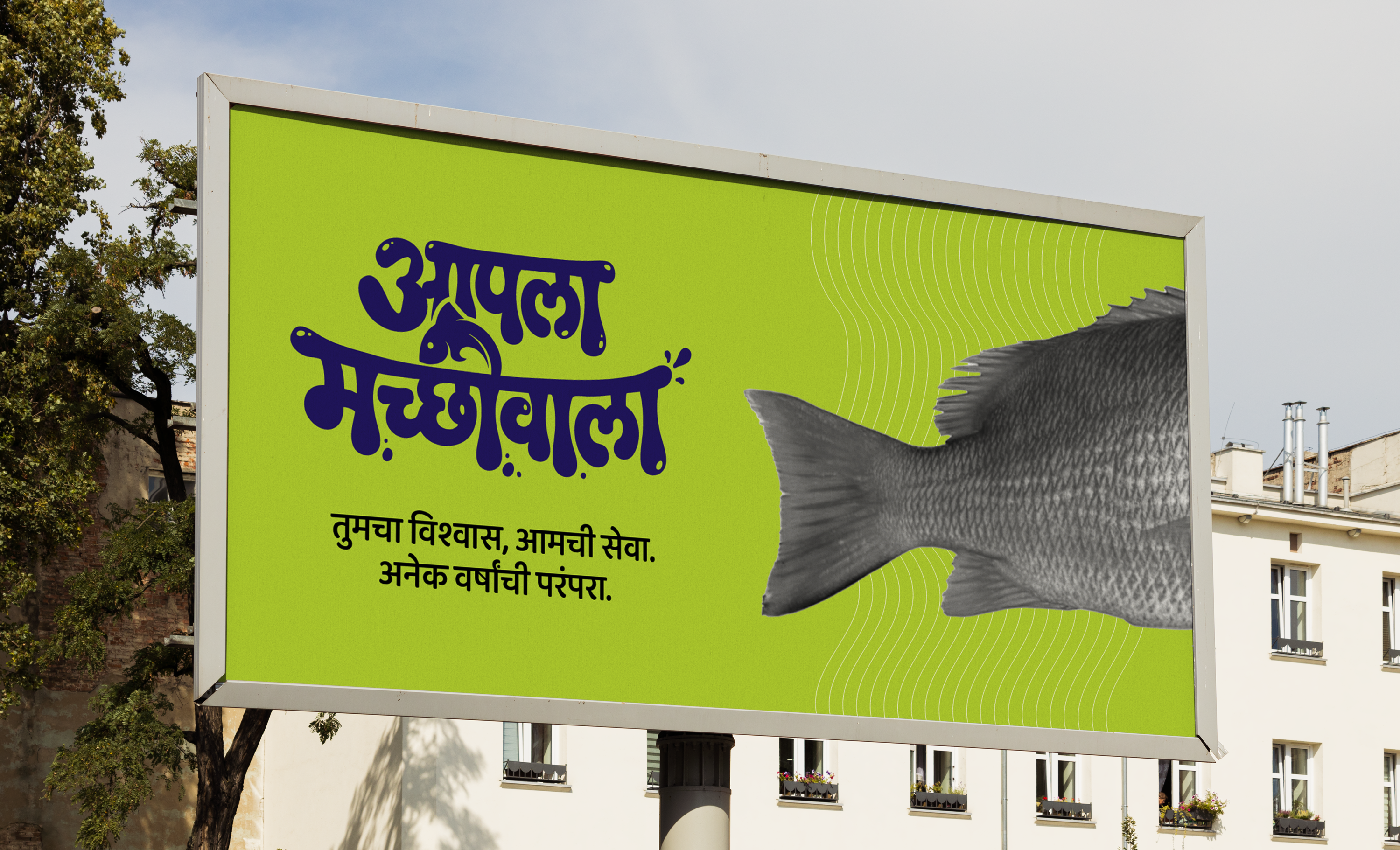
The fish-tail pattern, the heart-shaped tail mark, and the two-colour split scale cleanly from a tray sleeve to a delivery truck, holding the brand together across the journey from harbour to home.
Packaging is engineered to feel premium on shelf and unmistakable in a delivery bag.
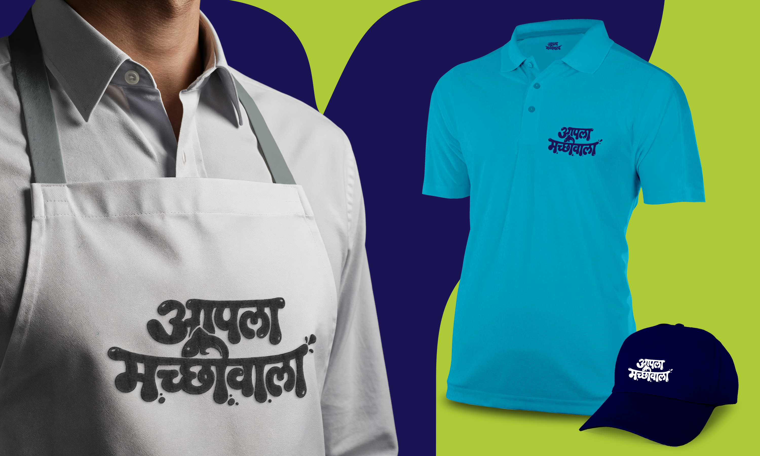
Aprons, polos, and caps carry the wordmark onto every shift, so the person handing over the catch looks every bit as fresh and trusted as the brand promises.
One identity, from the harbour to the doorstep.

The name already lived in people’s mouths. Our job was to make it look the way it already felt.