Client
Soro™
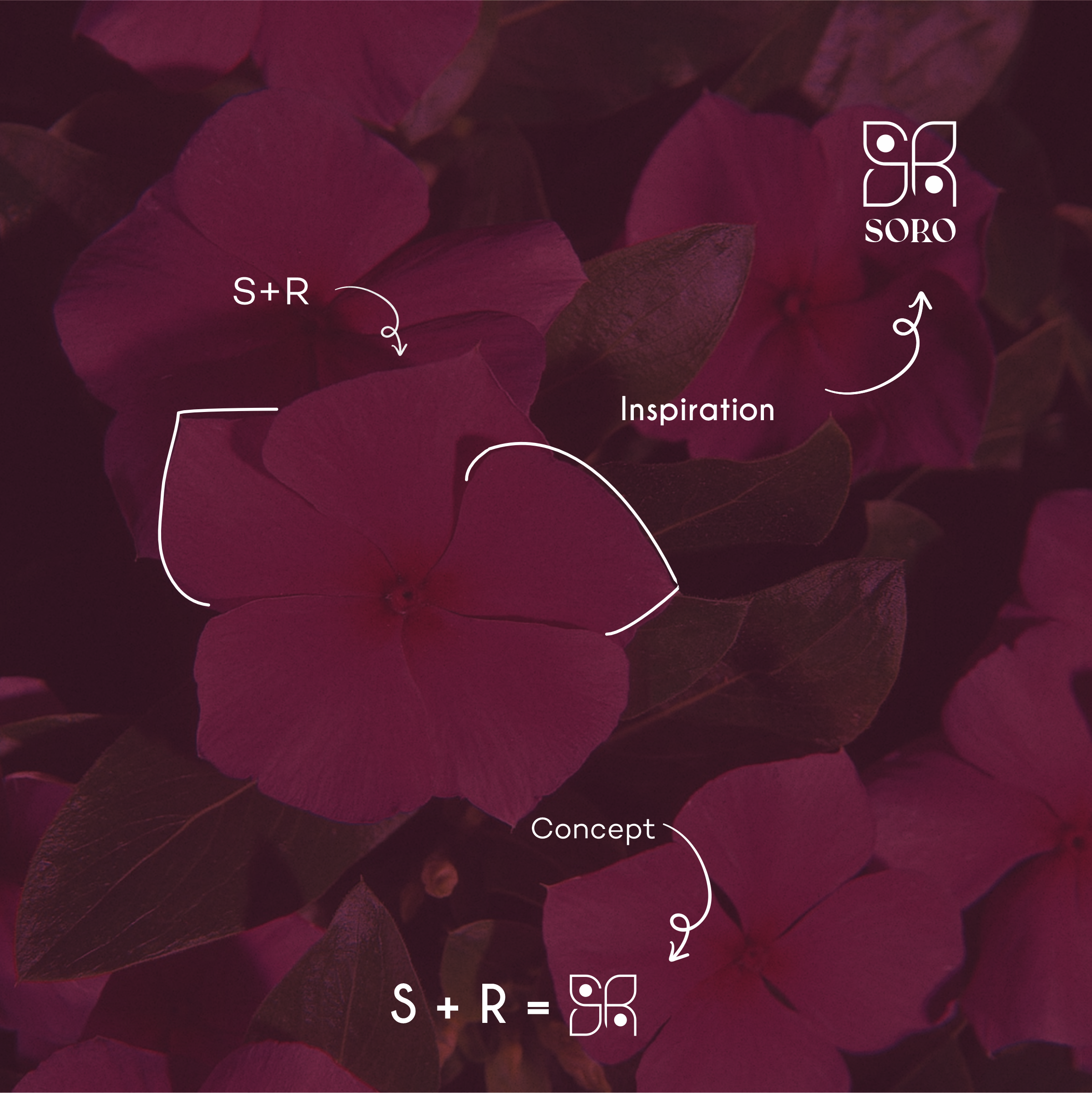
A contemporary fashion label built to feel timeless. The monogram is drawn from the periwinkle, a bloom that flowers almost year-round, folding an S and R into a single, enduring mark. Empower your identity.
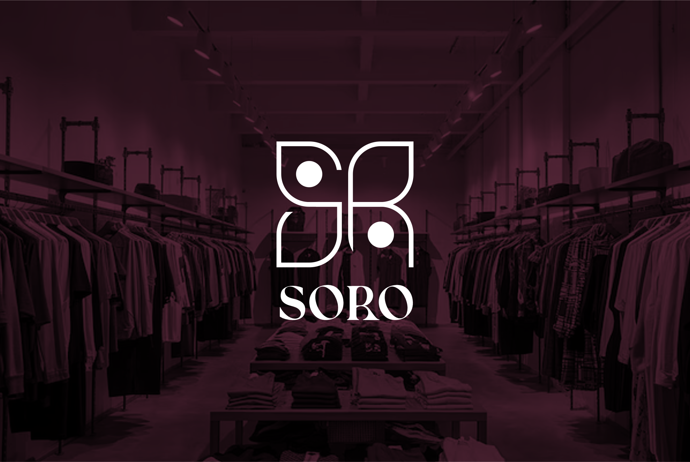
Soro needed an identity that could sit comfortably beside established fashion houses, refined, considered, and unmistakably its own.
We built the brand around a single symbol with a story: a flower that never stops blooming.
The periwinkle’s year-round bloom mirrors the promise, clothing that remains versatile, enduring, and relevant well beyond a single drop.
Empowering, elegant, and made to last.
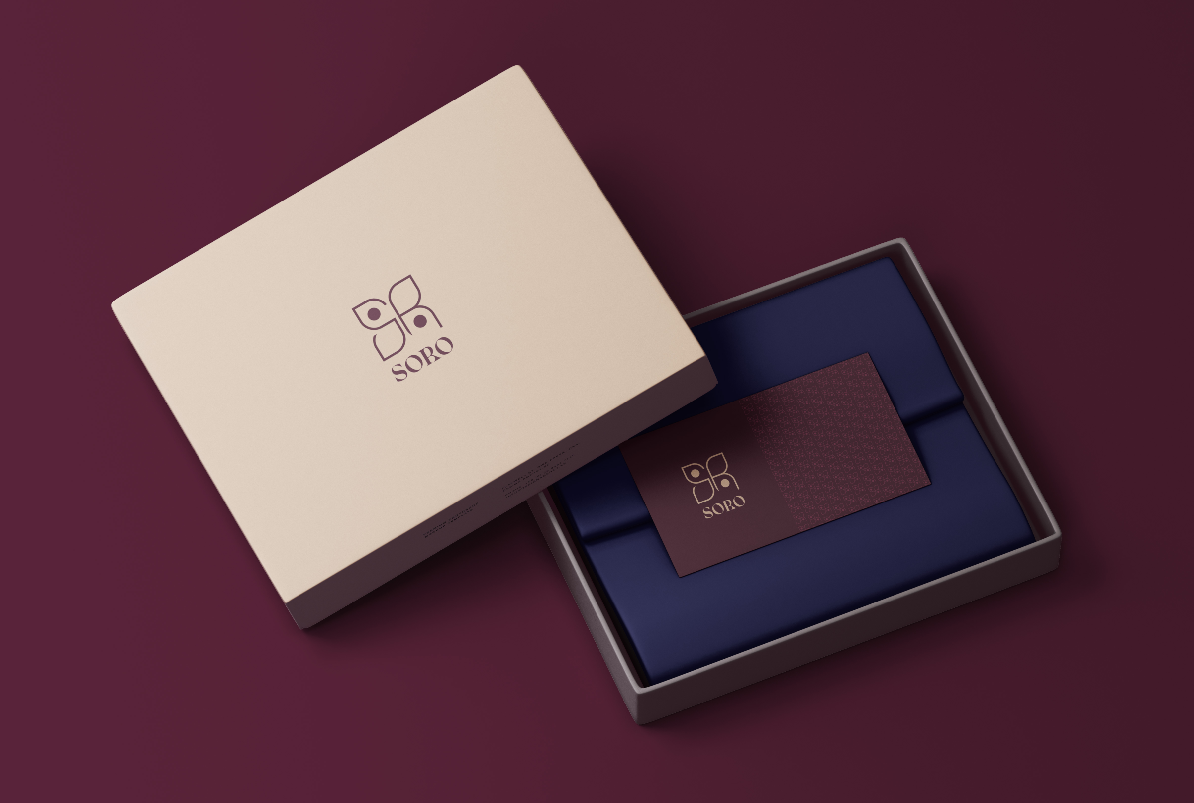
The S and R interlock into a four-petal flower. A deep maroon, soft cream, olive, and ochre palette pairs with the Kiak serif for a modern-yet-timeless feel.
The monogram repeats as a delicate pattern across the system.
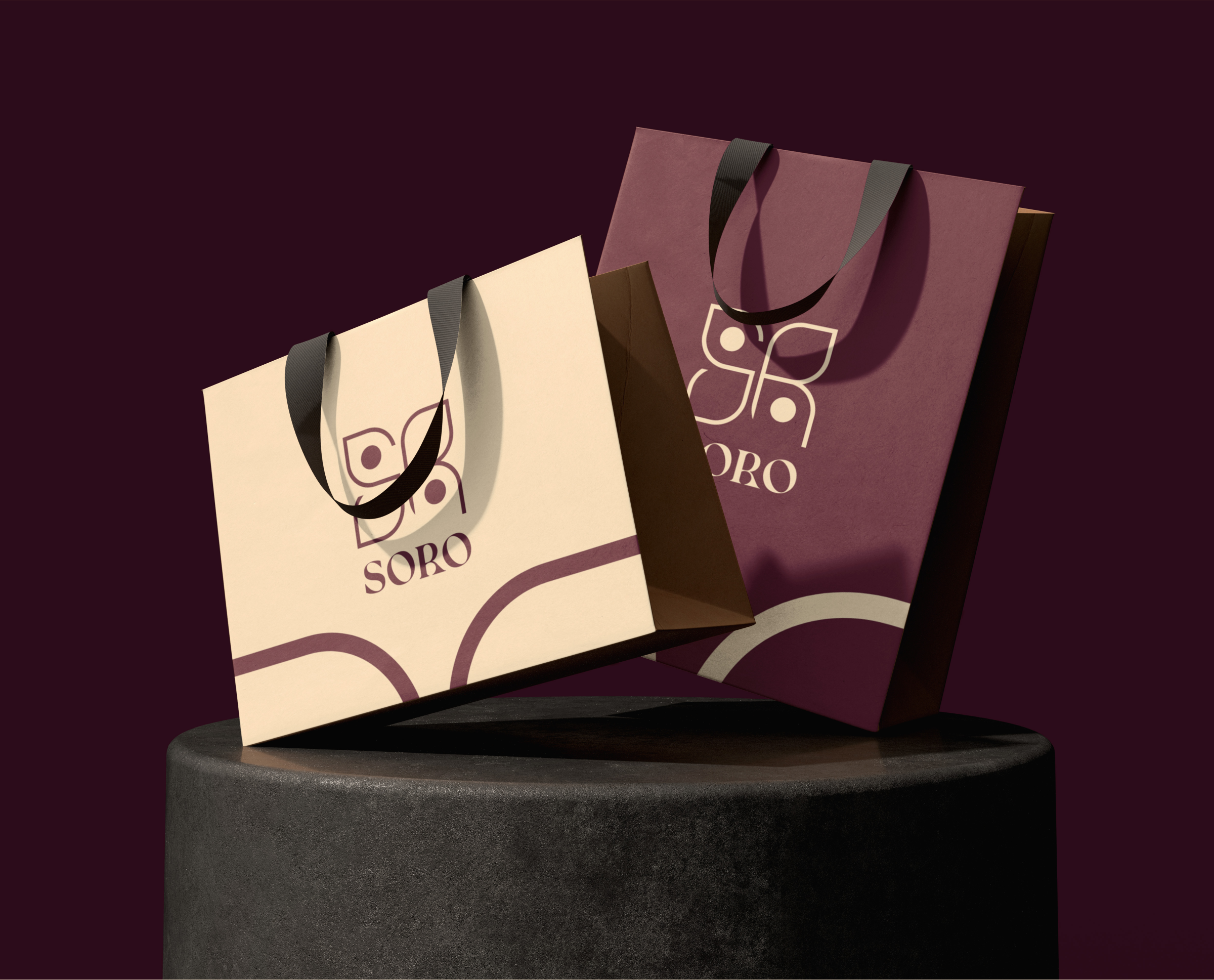
Bags, tags, and boxes are treated with the same restraint as the clothing, quality paper, considered colour, and the monogram given room to breathe.
The first physical contact should feel as luxurious as the wardrobe inside.
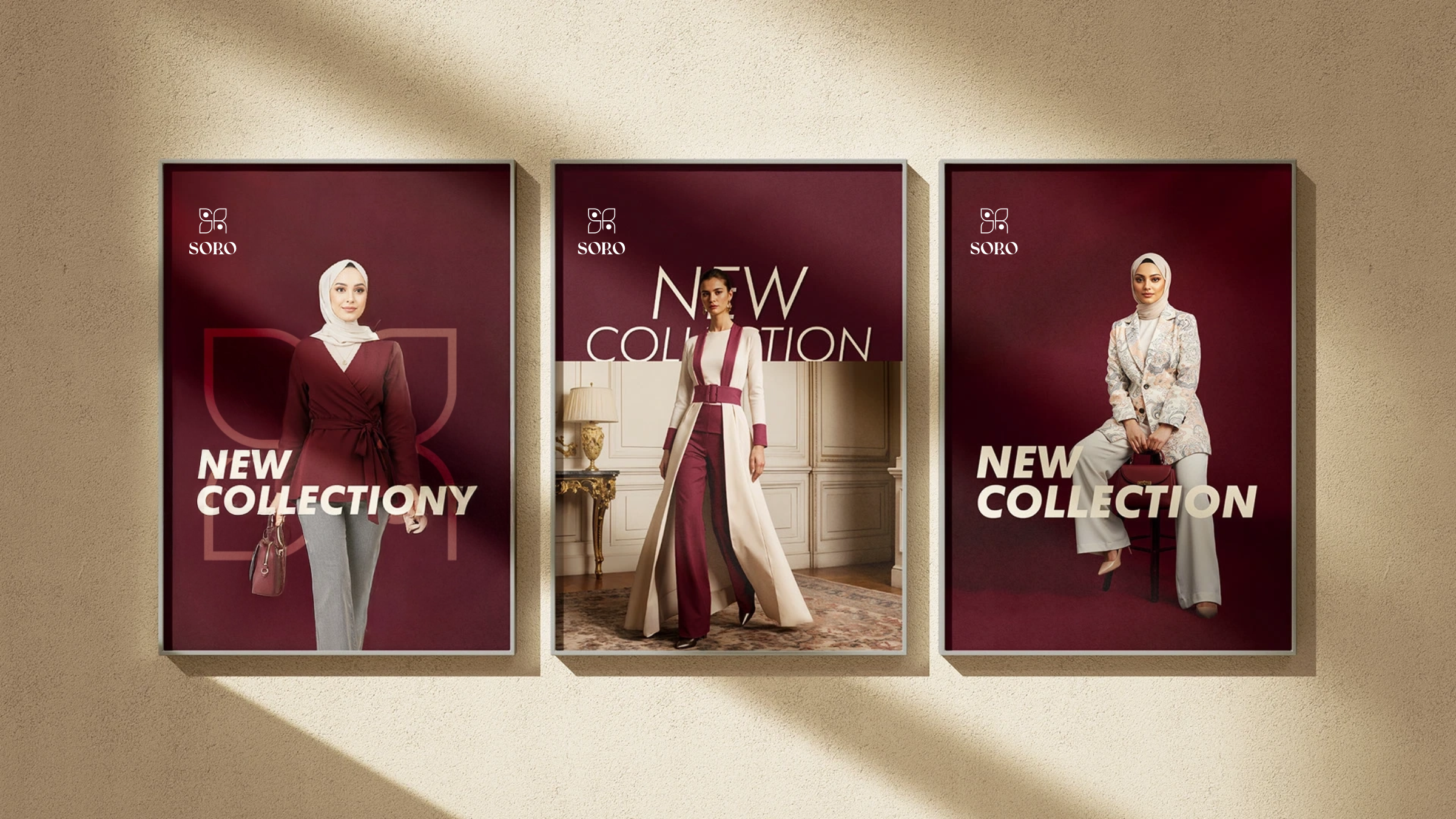
From storefront signage to a wrapped gift box, the symbol scales gracefully, legible at a distance, elegant up close, and instantly recognisable as Soro.
One bloom, carried consistently across every surface.
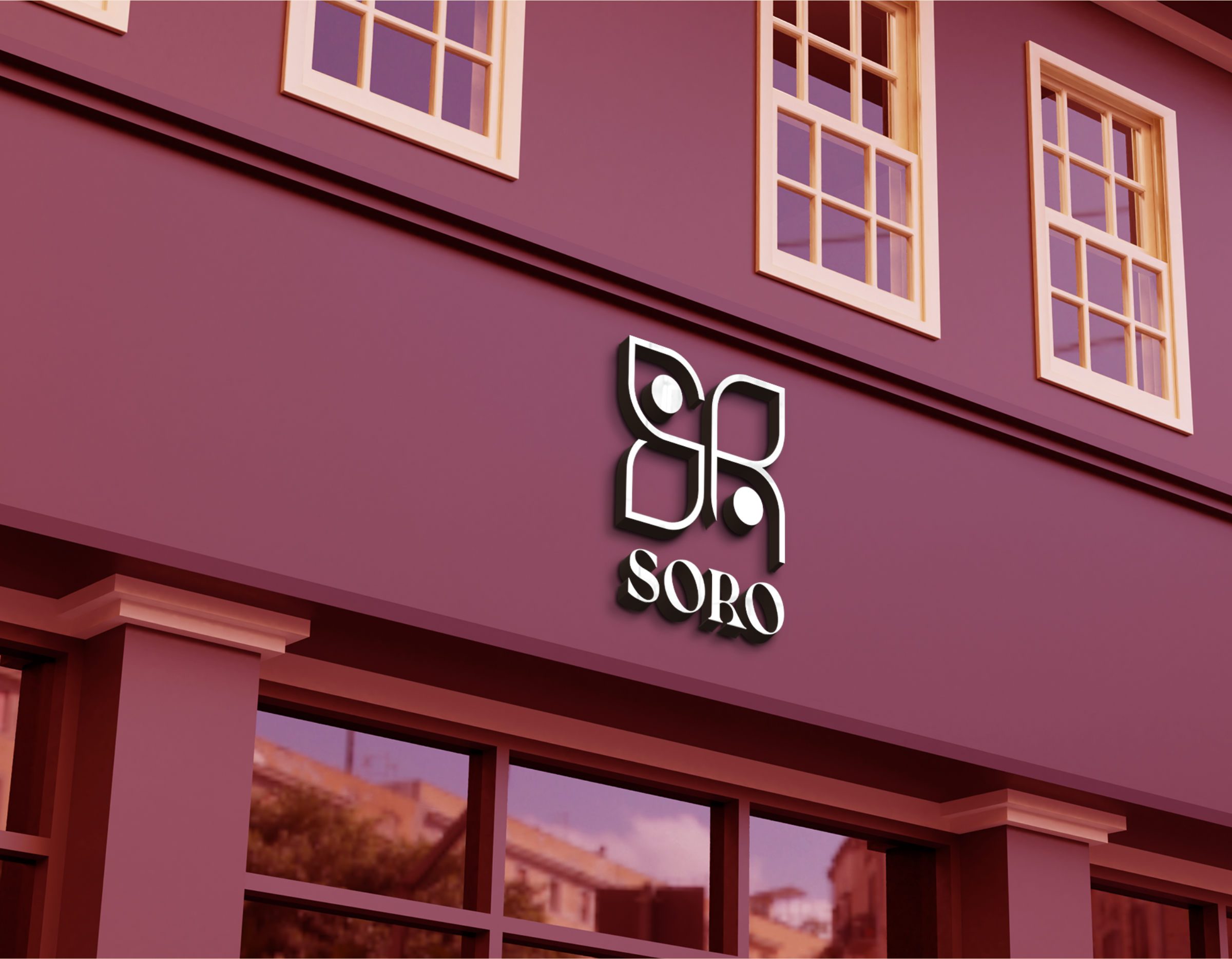

We wanted a mark that could outlast a trend, a flower that keeps blooming, season after season.